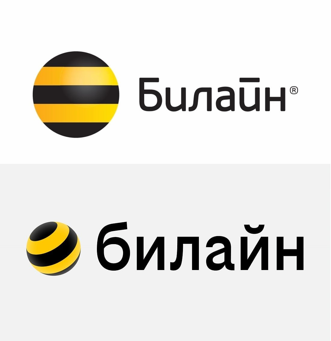
The Russian company “Beeline”, which provides telecommunications and mobile services, completely changed its logo and showed a new one.
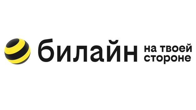
A new message has appeared on the official website of the Beeline company, which says about the brand renewal. According to Gamebomb.ru, along with the brand update, a new logo and slogan were introduced. It is worth noting that the Beeline logo is still the same circle in black and yellow stripes, but now it looks three-dimensional. It is noted that the brand renewal is intended to show the beginning of big changes in the company. At the same time, the name of the company is now written with a small letter – “beeline”. The lowercase spelling was adopted to emphasize “humanity, simplicity and digitality.”


The new slogan of the mobile operator now sounds like this – “On your side.” The company notes that an ordinary person with his own characteristics is now at the center of the updated brand. Baline is ready to support its clients and help them achieve their goals and objectives. This is the message the company is going to broadcast through its products, communication and visual identity. As for the updated logo, Beeline believes that this way it looks more dynamic and lively, and at the same time turns its face to people.
According to Gamebomb.ru, Beeline announced that it is now only at the beginning of a process of massive changes.


